23 Sep 2017
Remastered Ship Graphics
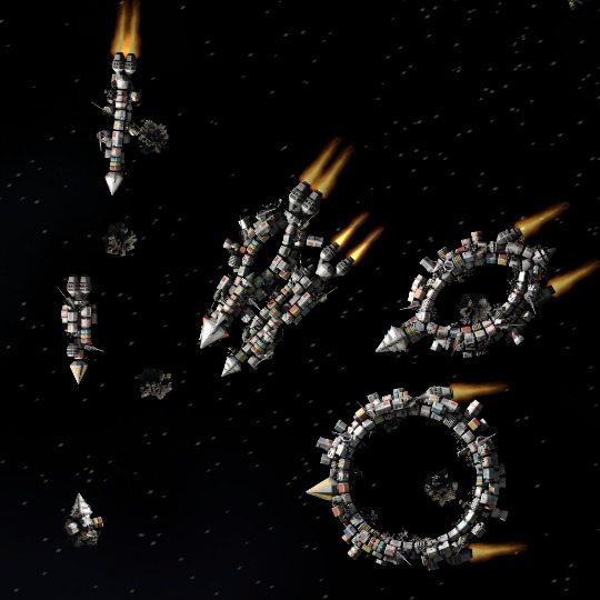
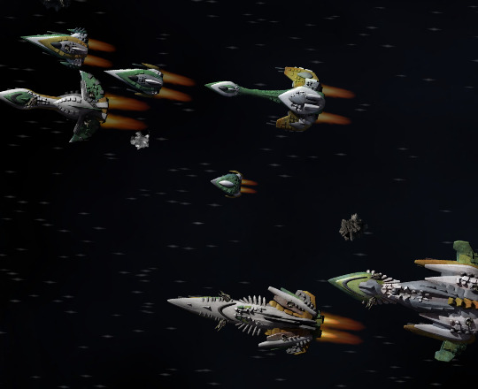
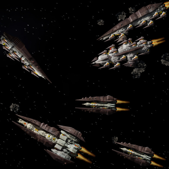
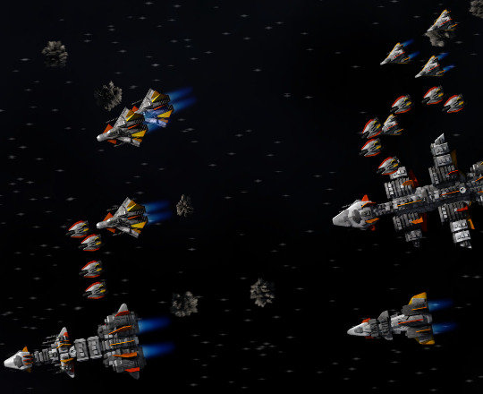
Recently I’ve been playing with different ideas for making the ships look less flat and cartoony, and I reached the conclusion that the real problem is that all the ships were rendered with nearly-overhead illumination (30° from vertical). I originally chose that illumination angle to avoid big dark shadows, but it turns out those shadows are necessary to give the shape of the ship definition. I’ve switched over to a much sharper illumination angle of 65°, manually adding “fill lights” to keep the shadows from being completely black, and I’m quite happy with the results:


The downside is that plugin creators will have to re-render their own ships to match, but the improvement is significant enough that I still think it’s worth doing - and better now than in a year or two when there are even more ships in the game!