08 Sep 2016
Designing ship sprites
The risk of designing a ship in Blender is that it will come out just looking like a jumble of geometric shapes, or too boxy and tied to the grid. So for most of my recent ship designs, I’ve been drawing them freehand on paper before modeling them in Blender. In just a few minutes of sketching, I can get a sense of whether a design is going to “work” or not, which is a lot better than spending an hour on building a model and then deciding the whole design idea just doesn’t work!
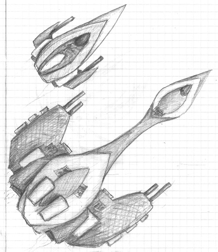
Your first goal in a concept sketch should be an interesting silhouette. No matter how much detail you add on the interior of the sprite, if the ship’s outline is just a simple geometric shape it will look artificial and simplistic. This is also the point where you should think about the visual balance of the ship as a whole. When you’re drawing a portrait, it’s easy to get so focused on drawing the nose or eyes just right that you forget to put them in the right relationship to the rest of the face and they end up too big or too small or in the wrong position. The same thing is true for ship sprites: making the wings or the cockpit a bit too big or too small can make the whole thing look awkward. Working with a sketch lets you tweak the big picture balance before getting too bogged down in the details.
The concept sketch phase is also a good time to think about developing a consistent design language for a particular species or shipyard. For example, all the Wanderer ships include the basic spearhead shape from the Summer Leaf, all the Kor Sestor ships include a dark, smooth “shell” and a lighter, greebled interior, and all the Kor Mereti ships are built from the same modular components. If chosen well, that design language will also communicate something to the player about the “personality” of a particular species or faction.
A third thing to think about when sketching a ship is how to vary the level of detail. In musical performance there’s a saying: “play the rests.” In other words, treat not just the notes but the periods of silence as an integral part of the composition. A song that’s just one giant drum solo, even if it’s a brilliant drum solo, will get monotonous. In the same way, make sure that your ship design includes areas of intricate detail, but also smooth areas with no fine detail.
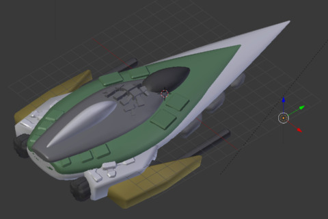
Of course, translating a sketch into a good-looking 3D model is the difficult part. The paradox is that even though a spaceship is an entirely artificial object, it will be much more interesting and visually pleasing if it looks natural and organic rather than being clearly artificial. A few things I’ve found helpful:
-
Avoid perfectly horizontal or vertical lines. Even just tapering the central fuselage slightly at both ends, for example, can make a huge difference.
-
Apply a bevel effect to everything. Real objects don’t have perfectly sharp corners.
-
Pay attention to the third dimension. Even though the ship is rendered top-down, its shape affects where shadows are cast. If you have “wings” on both sides, for example, tilt them down slightly so that the one on the left will be shaded a bit darker.
-
Render often, to see where the shadows are falling.
-
Reuse small pieces; don’t reuse large ones. You can paste the same greeble onto a dozen different ships (or even onto the same ship, rotated differently each time) and the player won’t notice, but don’t reuse a large chunk of one ship unless that’s an intentional part of the design (e.g. the Hauler).
-
Turn on ambient occlusion. It adds roughness and realism and accentuates the seams where surfaces meet.
-
Experiment with three-point lighting. (In addition to the sun, a very dim “fill light” to illuminate the shadows and a “back light” to accent the silhouette.)
-
If you want to play it safe, most of the ship should be colorless grey materials, with a few red, orange, or yellow patches of color. If you use a more adventurous coloring scheme, you’ll need to check how it looks at every possible color swizzle unless this ship can never be captured and is not used by more than one faction.
The final step is to export an image and post-process it. To keep things simple, aim for a final sprite with dimensions that are a multiple of 10. This avoids issues where the @2x sprite is not exactly twice the size of the @1x sprite. (For example, if you shrink an image with a width of 1000 to a 167-pixel-wide @1x image, its @2x width will be 333 pixels.)
Before doing any post-processing, test out different sprite sizes in the game to see what looks good and fits with the existing ships. Then, re-render the image at exactly 2 or 4 times the intended sprite size. Also make sure the @1x image will have at least a 1-pixel blank border on all sides so that the outline will render correctly.
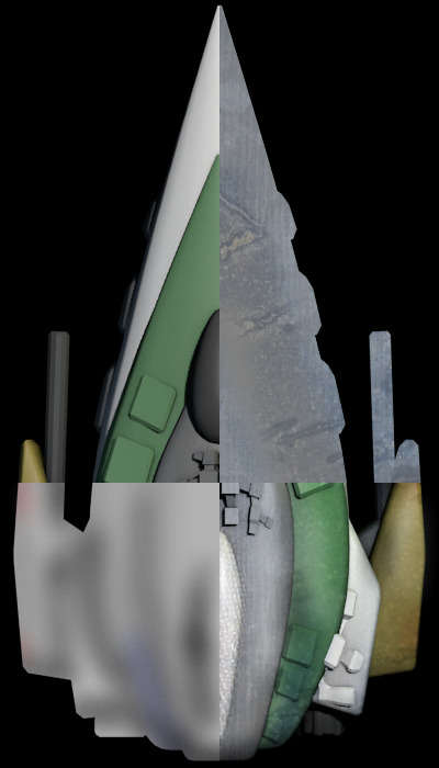
The goal of the post-processing is to dirty up the sprite so it doesn’t look like so obviously computer-generated. My first step is usually to overlay one or more metal textures, each using the “soft light” blending mode, and using the eraser to control what parts of the ship receive each texture. Even really grungy or rusty textures can work well here, but if the texture is too colorful you may want to reduce its saturation. As with all the design steps, the key is not to overdo the effect, but to keep it subtle.
The next step is to add artificial shadows and color gradients using the spray paint tool in a “multiply” layer. In the real world, metal looks metallic because of how it reflects things around it; painting dark patches on the edges or corners of parts of the ship can simulate that effect. Darkening the entire left side of the ship can help to make it look more three-dimensional, and darkening the edges near the engines simulates residue from engine exhaust. I also paint color over the colored parts of the ship to add variation in the hue.
When you’re ready to shrink the image down for export, I’ve found that ordinary bicubic interpolation works best: it adds a tiny bit of acutance, but without the obvious overshoot artifacts created by interpolation methods that sharpen the image before shrinking it.
To sum up, here are a few general principles to keep in mind:
-
Exercise restraint. It’s far too easy to overdo the use of color, texture, shadows, or sharpening.
-
Use organic shapes. Avoid grids, straight lines, flat surfaces, and boring silhouettes.
-
Clean, spotless spaceships look fake. Grungy spaceships look real.
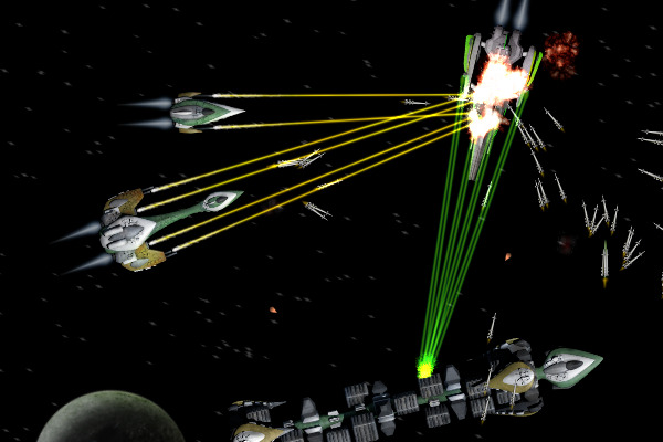
For more inspiration, check out the concept ships blog. Notice how most of the artists overlay hand-drawn effects over the 3D renders to make them look less artificial or to bring out certain features.